Introduction
LayoutBuilder is a small, powerful widget in Flutter that gives you access to the parent constraints at build time. For mobile development, mastering LayoutBuilder lets you adapt UI structure, spacing, and behavior to available space without relying solely on MediaQuery or hard-coded sizes. This article focuses on practical patterns, code examples, and performance considerations so you can build robust responsive UIs.
Understanding LayoutBuilder
LayoutBuilder provides BoxConstraints to its builder callback. Those constraints contain min/max width and height that the parent allows. Key points:
Use constraints.maxWidth to decide column counts, breakpoints, or when to switch to a compact design.
LayoutBuilder runs during the build phase and can rebuild its child when its parent constraints change.
It differs from MediaQuery: MediaQuery gives the whole screen size, while LayoutBuilder gives the size available for that subtree—critical inside nested or constrained layouts.
A minimal pattern:
LayoutBuilder(
  builder: (context, constraints) {
    if (constraints.maxWidth > 600) {
      return Row(children: [...]);
    }
    return Column(children: [...]);
  },
)
This pattern is the foundation for adaptive UIs where widgets rearrange themselves based on available width.
Responsive Breakpoints And Strategies
Pick breakpoints based on your layout needs, not arbitrary device labels. For mobile development you often want compact, medium, and expanded states (e.g., <360, 360–600, >600). Strategies:
Adaptive: Reflow content (Column → Row) when width crosses a breakpoint. Best for master/detail or toolbar changes.
Progressive Enhancement: Show extra decorations, larger paddings, or sidebars only above a breakpoint.
Fluid Layout: Adjust flex factors and spacing continuously by mapping constraints.maxWidth to sizes.
Example: scale padding and font-size proportionally instead of toggling values.
final width = constraints.maxWidth;
final padding = width < 360 ? 8.0 : width < 600 ? 16.0 : 24.0;
These tactics combine to make UIs that feel native across phones and tablets without maintaining separate widget trees.
Practical Layout Patterns
1) Responsive Grid: Use a SliverGrid or GridView with crossAxisCount determined by maxWidth. This yields consistent item sizing and simple reflow.
2) Master/Detail: In a narrow state display a stacked navigation, while in a wider state show both master and detail side by side inside a Row returned by LayoutBuilder.
3) Component-Level Adaptation: Wrap only complex components with LayoutBuilder instead of entire pages. That reduces unnecessary rebuilds and keeps logic localized.
4) Size-Aware Animations: Use the constraints to animate transitions between compact and expanded states, adjusting durations or curves based on the space change.
Code example combining Grid and adaptive padding:
LayoutBuilder(builder: (context, constraints) {
  final cols = constraints.maxWidth > 800 ? 4 : constraints.maxWidth > 500 ? 3 : 2;
  return GridView.count(crossAxisCount: cols, padding: EdgeInsets.all(12));
});
Performance Considerations
LayoutBuilder is cheap, but misuse can cause extra work:
Avoid heavy logic or synchronous I/O inside the builder. Builder runs during build; keep it deterministic and fast.
Prefer local LayoutBuilders scoped to the component that needs the constraints. Wrapping entire screens forces many children to rebuild unnecessarily.
Combine with const widgets and keys where appropriate so downstream children avoid rebuilds when only layout decisions change.
Beware of infinite layout loops: do not query size and then call setState synchronously based on those constraints inside the same build cycle.
Testing performance: use Flutter's performance overlay and the DevTools rebuild tracker to watch how often LayoutBuilder and its descendants build as you resize or navigate.
Vibe Studio
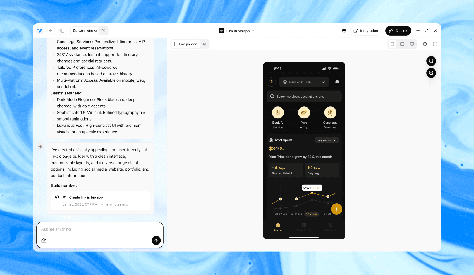
Vibe Studio, powered by Steve’s advanced AI agents, is a revolutionary no-code, conversational platform that empowers users to quickly and efficiently create full-stack Flutter applications integrated seamlessly with Firebase backend services. Ideal for solo founders, startups, and agile engineering teams, Vibe Studio allows users to visually manage and deploy Flutter apps, greatly accelerating the development process. The intuitive conversational interface simplifies complex development tasks, making app creation accessible even for non-coders.
Conclusion
LayoutBuilder is a precise tool for building responsive UIs in flutter mobile development. Use constraints.maxWidth and maxHeight to drive layout decisions, prefer local scoping, and choose breakpoints that reflect your UI's needs. With a few patterns — adaptive, progressive, and fluid — you can construct interfaces that scale cleanly from small phones to tablets without duplicating code. Keep builders lightweight, test rebuilds, and balance between LayoutBuilder and other responsive helpers like MediaQuery or OrientationBuilder for the best results.


