Introduction
Pixel-perfect UI matters in mobile development: small alignment, spacing, or typographic differences quickly make an app feel unpolished. Flutter's compositional UI model gives you precise control over layout, painting, and theming — but that power requires discipline. This tutorial shows practical techniques to build pixel-perfect components in Flutter: establish tokens and scales, control layout at device-pixel granularity, manage typography and icons, and implement custom widgets and drawing when necessary.
Establish Design Tokens And Scales
Start with a single source of truth for colors, spacing, radii, and type. Use a Theme extension or a Dart constants file so components consume the same values. Design tokens let you translate designer artifacts (pt, px) into device-aware values at runtime.
Define base spacing and scale steps (4px grid, 8px rhythm).
Centralize color swatches and elevation shadows.
Provide typography scales (headline, body, caption) tied to font sizes, weights, and letter spacing.
Example: a minimal Theme extension for spacing and radius.
import 'package:flutter/material.dart';
class AppTokens extends ThemeExtension<AppTokens> {
  final double spacingUnit; final double radius;
  const AppTokens({this.spacingUnit = 8, this.radius = 6});
  @override AppTokens copyWith({double? spacingUnit, double? radius}) =>
    AppTokens(spacingUnit: spacingUnit ?? this.spacingUnit, radius: radius ?? this.radius);
  @override AppTokens lerp(ThemeExtension<AppTokens>? other, double t) => this;
}
Consume tokens in widgets via Theme.of(context).extension() to keep components consistent and easy to update.
Master Layout, Spacing, And Alignment
Flutter's layout primitives (Row, Column, Stack, Align, FractionallySizedBox) provide exact placement. To achieve pixel-perfect layout:
Design on a consistent grid. Multiply spacingUnit for paddings and gaps.
Prefer SizedBox for fixed spacing; use const where possible for performance.
Use Align and FractionalOffset for percent-based positioning. Avoid hard-coded pixel offsets unless mapped from tokens.
Account for devicePixelRatio when you need 1 physical pixel borders: render 1 / MediaQuery.of(context).devicePixelRatio logical pixels.
Example: hairline border that stays one physical pixel thick.
final double hairline = 1 / MediaQuery.of(context).devicePixelRatio;
Container(height: 44, decoration: BoxDecoration(border: Border(bottom: BorderSide(width: hairline, color: Colors.grey))));
Also use LayoutBuilder to measure parent constraints and adapt sizes deterministically, which prevents rounding artifacts across screen sizes.
Implement Typography And Iconography Precisely
Typography is critical for perceived polish. Use text styles from the theme and specify letterSpacing and height explicitly.
Lock line-height by setting height in TextStyle to avoid platform defaults.
Use TextHeightBehavior to control ascent/descent clipping when aligning across baselines.
For icons, prefer Icon fonts or vector assets (SVG) exported at predictable viewBoxes. Scale icons with integer multiples of your base grid to avoid half-pixel blurring.
Tip: test fonts at multiple devicePixelRatios and use GoogleFonts or packaged fonts for consistent metrics. Use textBaseline and Baseline widgets to align text across widgets precisely.
Build Custom Widgets And Pixel-Perfect Drawing
When standard widgets can't match the spec, implement RenderObjects or CustomPainter for ultimate control. CustomPainter lets you draw crisp shapes and borders with explicit handling of device pixel ratios.
Use Canvas.translate(0.5, 0.5) or hairline width offsets to align strokes to physical pixels.
Cache paths and repaint only when properties change; use shouldRepaint conservatively.
Keep painting operations simple and avoid heavy allocations in paint().
Short CustomPainter pattern:
class StrokePainter extends CustomPainter {
  final Color color; StrokePainter(this.color);
  @override void paint(Canvas canvas, Size size) {
    final paint = Paint()..color = color..style = PaintingStyle.stroke..strokeWidth = 1;
    canvas.drawRRect(RRect.fromRectAndRadius(Offset.zero & size, Radius.circular(6)), paint);
  }
  @override bool shouldRepaint(covariant StrokePainter old) => old.color != color;
}
Use widget-level tests and golden tests (flutter_test + flutter_goldens) to detect pixel regressions early. Capture screenshots on multiple device pixel ratios and compare.
Vibe Studio
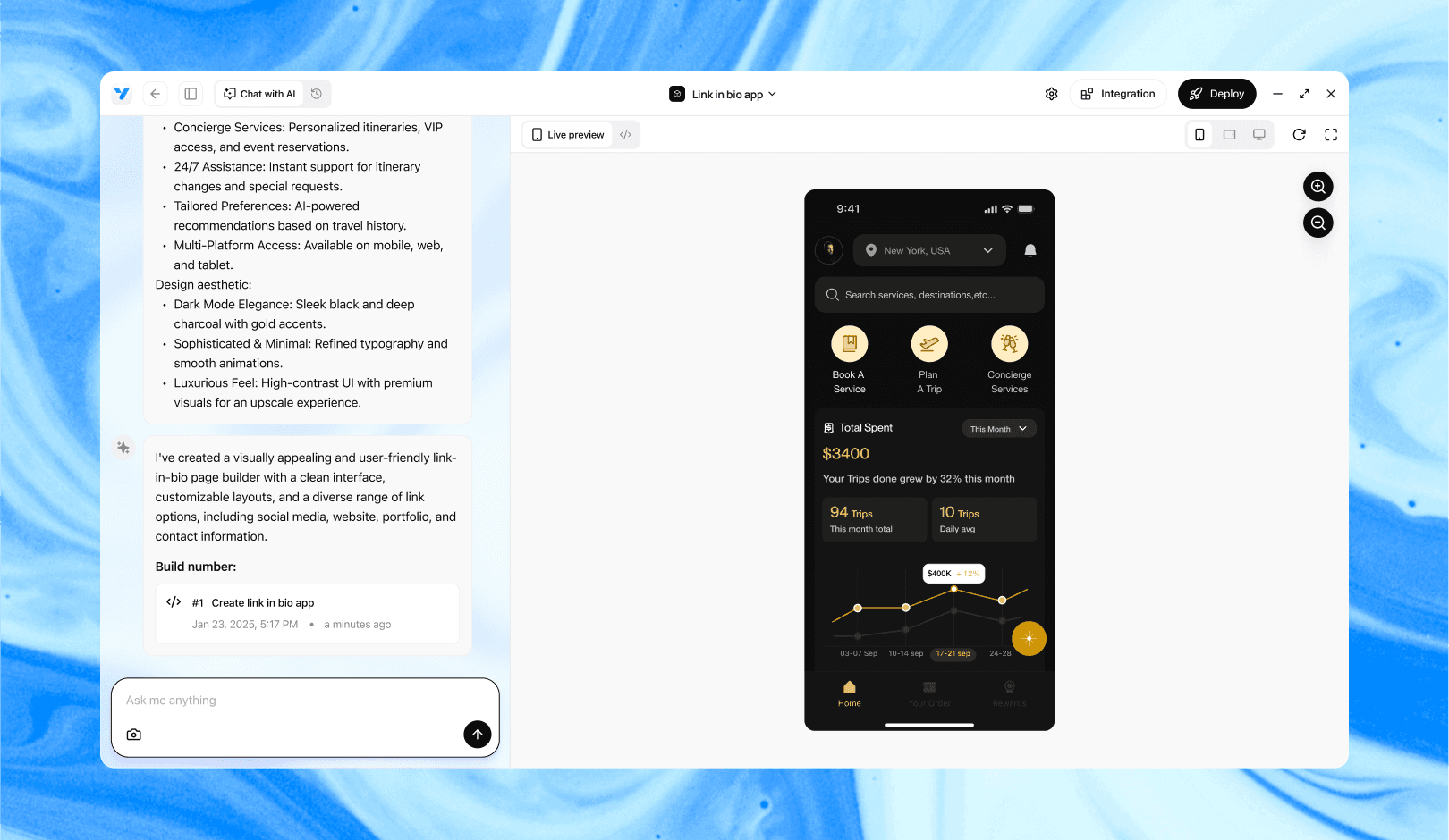
Vibe Studio, powered by Steve’s advanced AI agents, is a revolutionary no-code, conversational platform that empowers users to quickly and efficiently create full-stack Flutter applications integrated seamlessly with Firebase backend services. Ideal for solo founders, startups, and agile engineering teams, Vibe Studio allows users to visually manage and deploy Flutter apps, greatly accelerating the development process. The intuitive conversational interface simplifies complex development tasks, making app creation accessible even for non-coders.
Conclusion
Building pixel-perfect UIs in Flutter is a combination of systematizing design tokens, applying deterministic layout rules, controlling typography and icons, and using custom painting when needed. Centralize your tokens, respect device pixel ratio for hairline details, and automate visual tests. With disciplined patterns and a few low-level techniques you'll deliver mobile interfaces that match design specs closely and feel consistently polished across devices.


