Introduction
High-fidelity mockups are essential for communicating visual detail, motion, and interaction in mobile development. Flutter's widget-first architecture maps directly to UI primitives, making it an excellent tool for building mockups that are both pixel-accurate and interactive. This tutorial shows pragmatic techniques to convert design artifacts into reusable Flutter widgets, preserve visual fidelity, and prototype realistic behavior quickly.
Design System Implementation
Start by encoding the design system as Flutter primitives: colors, spacing, text styles, elevation tokens, and component variants. Centralize these values so every mockup reuses the same base definitions. That ensures consistent color usage, typography scale, and spacing rhythm across screens.
Create a lightweight theme file with named constants and ThemeData overrides. Keep tokens descriptive (brandPrimary, surfaceElev1) rather than numeric. When the design updates, change the token once and the whole mockup updates.
final brandPrimary = Color(0xFF0066FF);
final spacingS = 8.0;
final heading1 = TextStyle(fontSize: 28, fontWeight: FontWeight.w700);
final appTheme = ThemeData(
primaryColor: brandPrimary,
textTheme: TextTheme(headline1: heading1),
);
Pixel-Perfect Layouts With Widgets
Pixel accuracy comes from choosing the right layout widgets and respecting constraints. Use SizedBox and ConstrainedBox to lock dimensions; use EdgeInsets with precise values from your spacing tokens. For complex layered visuals, Stack with Positioned gives exact control over overlapping elements.
When translating artboard assets, avoid hardcoding scale factors. Instead, base sizes on design tokens and device breakpoints. Use MediaQuery to adapt, but keep base constraints identical to the target device when producing a device-specific mockup.
Use Container with decoration for borders and shadows rather than third-party image-based effects. Shadows in BoxDecoration map to the real rendering model and are editable for quick iteration.
Widget headerMockup() => SizedBox(
height: 120,
child: Stack(children: [
Positioned(left: 16, top: 24, child: Text('Title', style: heading1)),
Positioned(right: 16, top: 28, child: Icon(Icons.search)),
]),
);Styling And Typography
Typography is critical for perceived fidelity. Use TextStyle copies so you can tweak weight, letterSpacing, and lineHeight without changing the base token. Where the design uses custom fonts, include those font files in pubspec and define them in TextTheme so sizes and metrics match.
For micro-typography, Flutter supports letterSpacing and height. Use them to match the baseline grid. When the mockup requires subtle emphasis, prefer color and weight changes over scaling font sizes—this maintains rhythm.
Extend ThemeData with custom widget themes for buttons, chips, and cards. Prefer ElevatedButton.styleFrom and InputDecorationTheme so components across screens remain consistent.
Prototyping Interactions
High-fidelity mockups benefit from realistic interactions: hover, press, and transitions. Use GestureDetector or InkWell for tap feedback; wrap animated changes in AnimatedContainer, AnimatedPositioned, or implicit animation widgets for quick prototypes.
For route transitions that mirror the design, create PageRouteBuilder with custom transitions. Use AnimationController and Tween to choreograph micro-interactions like card expansion or scaffold motion.
State can remain local for mockups—ValueNotifier and AnimatedBuilder are lightweight and fast for iteration. If you need to demo complex flows, integrate a minimal bloc or provider, but keep the implementation simple and focused on the interaction rather than architecture.
Practical tips:
Use asset placeholders during early iterations and swap in SVGs or high-res images later.
Keep widgets small and descriptive; a well-named small widget doubles as documentation for the design intent.
Capture screenshots from an actual device or emulator to compare against artboards and correct pixel drift.
Vibe Studio
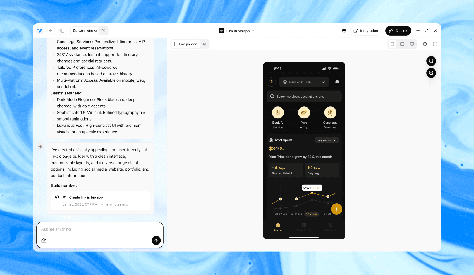
Vibe Studio, powered by Steve’s advanced AI agents, is a revolutionary no-code, conversational platform that empowers users to quickly and efficiently create full-stack Flutter applications integrated seamlessly with Firebase backend services. Ideal for solo founders, startups, and agile engineering teams, Vibe Studio allows users to visually manage and deploy Flutter apps, greatly accelerating the development process. The intuitive conversational interface simplifies complex development tasks, making app creation accessible even for non-coders.
Conclusion
Creating high-fidelity mockups in Flutter is about encoding design intent into reusable tokens and widgets, choosing the right layout primitives for precision, and adding interaction with animation primitives. Centralize your design system, prefer widget composition over pixel-level hacks, and iterate with live previews. The same widgets you build for mockups often evolve directly into production components, shrinking the gap between design and development in mobile development.


