Introduction
Beautiful gradients and realistic shadows elevate UI polish in Flutter mobile development without relying on plugins. Flutter ships with powerful primitives—BoxDecoration, Gradient subclasses, BoxShadow, PhysicalModel, ShaderMask, and CustomPainter—that let you build rich visuals with predictable performance. This tutorial shows practical patterns for linear, radial, sweep gradients, and multiple shadow techniques, with concise code examples you can drop into your app.
Linear And Radial Gradients
LinearGradient and RadialGradient are the starting point. Use gradients in BoxDecoration for backgrounds, or as Paint.shader in CustomPainter for more control. Key properties: colors, stops, begin/end (Alignment), focal and focalRadius (radial). For a crisp look, choose color stops deliberately and avoid too many stops—3–4 is usually sufficient.
Example: a card background using LinearGradient and BoxShadow.
Container(
  decoration: BoxDecoration(
    gradient: LinearGradient(
      begin: Alignment.topLeft,
      end: Alignment.bottomRight,
      colors: [Colors.blue.shade400, Colors.purple.shade600],
      stops: [0.0, 1.0],
    ),
    borderRadius: BorderRadius.circular(16),
    boxShadow: [BoxShadow(color: Colors.black26, blurRadius: 12, offset: Offset(0,6))],
  ),
  child: Padding(padding: EdgeInsets.all(16), child: Text('Gradient Card')),
)
Use RadialGradient when attention should focus on a center point. Radial gradients combine well with light source positioning to create depth on circular UI elements.
Sweep Gradients And ShaderMask
SweepGradient (conic-like) is great for progress rings and subtle color rotations. For text or icon fills, ShaderMask applies a gradient shader to a child widget. ShaderMask lets you animate shader properties while preserving the child’s layout and semantics.
Example: gradient text using ShaderMask (conceptual): wrap Text in ShaderMask and supply a LinearGradient.createShader that maps to the text bounds.
Performance tip: ShaderMask creates an extra layer; use it sparingly for small elements like icons or headings rather than large scrolling regions.
Shadows And Elevation Control
BoxShadow on BoxDecoration is the simplest approach: adjust color (semi-transparent), blurRadius, spreadRadius, and offset. For material-like elevation, use Material or PhysicalModel; they also clip and apply elevation shadows consistently across platforms.
For custom shapes or vector paths, use Canvas.drawShadow in a CustomPainter—this gives realistic ambient and directional shadow casting for arbitrary paths.
@override
void paint(Canvas canvas, Size size) {
  final path = Path()..addOval(Rect.fromLTWH(20,20,100,100));
  canvas.drawShadow(path, Colors.black.withOpacity(0.4), 8.0, true);
  final paint = Paint()..color = Colors.orange;
  canvas.drawPath(path, paint);
}
Use drawShadow for non-rectangular shapes where BoxShadow won't suffice. Note drawShadow is more expensive; combine with RepaintBoundary to limit repaints.
Combining Gradients And Shadows For Components
Common patterns:
Card With Depth: Gradient background + subtle BoxShadow; round corners with ClipRRect to ensure shadow aligns with shape.
Floating Buttons: Use PhysicalModel or Material with elevation to get OS-consistent shadows; layer a gradient using DecoratedBox inside the button.
Iconography: Use ShaderMask for gradient fills and a small BoxShadow or cast shadow painted in CustomPainter for depth.
Animation: animate gradients using AnimatedContainer (for simple begin/end changes) or by animating a SweepGradient angle in a CustomPainter for smooth, GPU-friendly animation. Avoid rebuilding the whole tree each frame—update only the painter or shader parameters.
Accessibility & Contrast: Ensure gradient overlays don't reduce text contrast. Use semi-transparent scrims (e.g., black.withOpacity(0.4)) at text edges or compute contrast-aware foreground colors.
Performance Checklist:
Prefer BoxDecoration gradients and BoxShadow for static content.
Use CustomPainter and drawShadow sparingly; isolate with RepaintBoundary.
Cache shaders if reusing across widgets, and avoid animating large repaint areas.
Test on device; desktop simulators overestimate GPU capability compared to lower-end phones.
Vibe Studio
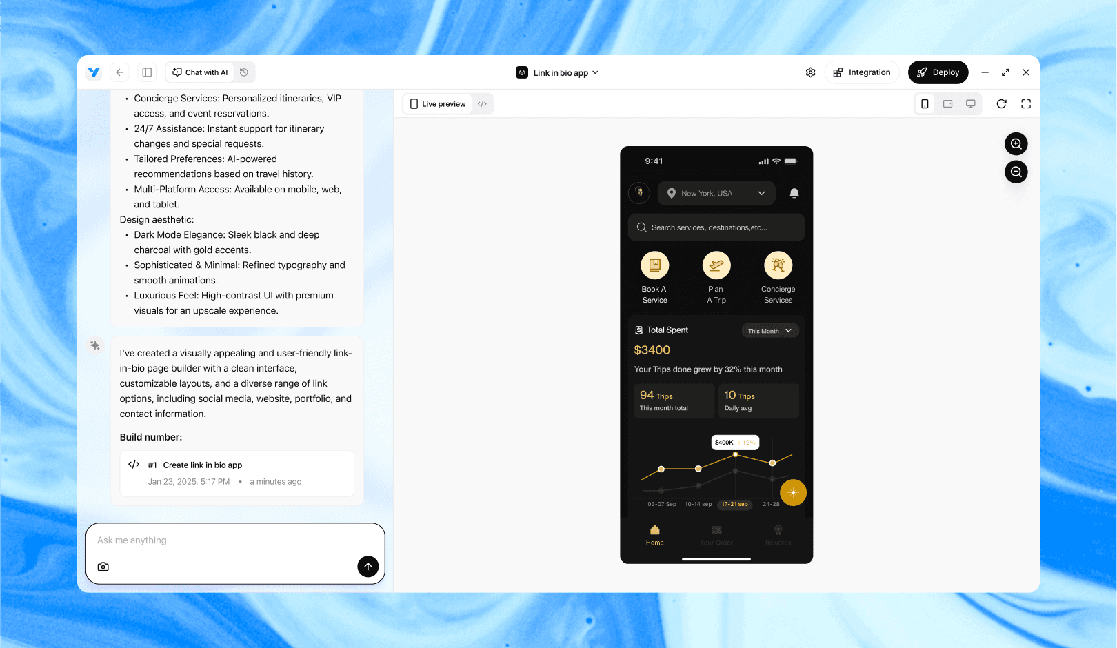
Vibe Studio, powered by Steve’s advanced AI agents, is a revolutionary no-code, conversational platform that empowers users to quickly and efficiently create full-stack Flutter applications integrated seamlessly with Firebase backend services. Ideal for solo founders, startups, and agile engineering teams, Vibe Studio allows users to visually manage and deploy Flutter apps, greatly accelerating the development process. The intuitive conversational interface simplifies complex development tasks, making app creation accessible even for non-coders.
Conclusion
You don’t need plugins to create expressive gradients and convincing shadows in Flutter. Use built-in Gradient types, ShaderMask, BoxShadow, PhysicalModel, and CustomPainter to cover most design needs in mobile development. Combine these primitives thoughtfully: gradients for color language, shadows for depth, and careful performance management to keep UI smooth and accessible.


