Introduction
Accessible color systems are not optional in modern mobile development. Poor contrast or inconsistent semantics can make an app unusable for people with low vision or color deficiencies. In Flutter, building an accessible palette means thinking in tokens, testing contrast programmatically, and wiring dynamic themes so colors remain usable across contexts. This article shows practical patterns and small code examples you can drop into a Flutter app.
Designing For Contrast
Start with contrast principles rather than isolated swatches. WCAG defines minimum contrast ratios: 4.5:1 for normal text and 3:1 for large text. That influences decisions such as primary foreground/background pairs, disabled states, and semantic accents.
Workflow:
Define background and surface levels first (primary, elevated, inverse).
Choose accessible foregrounds for each background using luminance and contrast checks.
Favor semantic roles (textPrimary, textSecondary, icon, success, error) that map to tokens rather than raw hex values.
Use grayscale steps for typography. A single off-black on an off-white background will often pass contrast where pure black on a saturated background might fail. Plan light and dark palettes together to avoid surprises when switching themes.
Implementing Semantic Color Tokens
Semantic tokens separate intent from color values. Implement tokens as high-level properties that derive actual colors from a base palette. This lets you swap palettes or adjust contrast without changing widgets.
Example: a helper that picks an accessible foreground for a background using relative luminance and contrast heuristics.
Color accessibleForeground(Color background) {
final double bgLum = background.computeLuminance();
final whiteContrast = (1.0 + 0.05) / (bgLum + 0.05);
final blackContrast = (bgLum + 0.05) / (0.0 + 0.05);
return whiteContrast >= blackContrast ? Color(0xFFFFFFFF) : Color(0xFF000000);
}Integrate this into a token system where a token is either a fixed color or a function that receives the background context. For Material apps, wrap tokens in Theme extensions or build ColorScheme values from tokens so widgets consume semantics, not hex.
Testing Color Accessibility
Automate contrast checks in unit and golden tests. A simple contrast function helps assert tokens meet WCAG thresholds. Test both light and dark themes and check dynamic states (disabled, pressed, hovered).
Checklist for tests:
Verify textPrimary on surface meets 4.5:1 for body sizes.
Verify large headers meet 3:1 if larger than 18pt or bold 14pt equivalent.
Assert icons and controls meet touch-target contrast heuristics.
Use device simulators with platform accessibility settings (large text, high contrast where available) to validate real-world interaction. For color-blindness checks, use overlays or color-simulation tools in design handoff, but programmatic contrast is your first line of defense.
Dynamic Theming And Contrast Adjustment
Users expect themes to adapt: dark mode, accessibility modes, and user-selected accent colors. Architect tokens so runtime inputs can modify derived colors. Strategies:
Derive foregrounds dynamically from a computed background using the contrast helper above.
Provide an accessibility-enhanced palette toggle that increases contrast by switching to higher delta luminance steps.
Respect user-selected color accents but clamp them into an accessible space: compute accessible text/icon colors against the chosen accent and fall back to a safe alternative if the contrast is insufficient.
Example: creating a ColorScheme that derives text colors from base surface colors.
final ColorScheme accessibleScheme(Color primary, Color surface) {
  final text = accessibleForeground(surface);
  return ColorScheme.light(
    primary: primary,
    surface: surface,
    onSurface: text,
    onPrimary: accessibleForeground(primary),
  );
}
Expose a small settings toggle that applies an accessibility contrast multiplier to your token generator. That multiplier can increase differences between adjacent grayscale steps or lift foreground luminance programmatically.
Vibe Studio
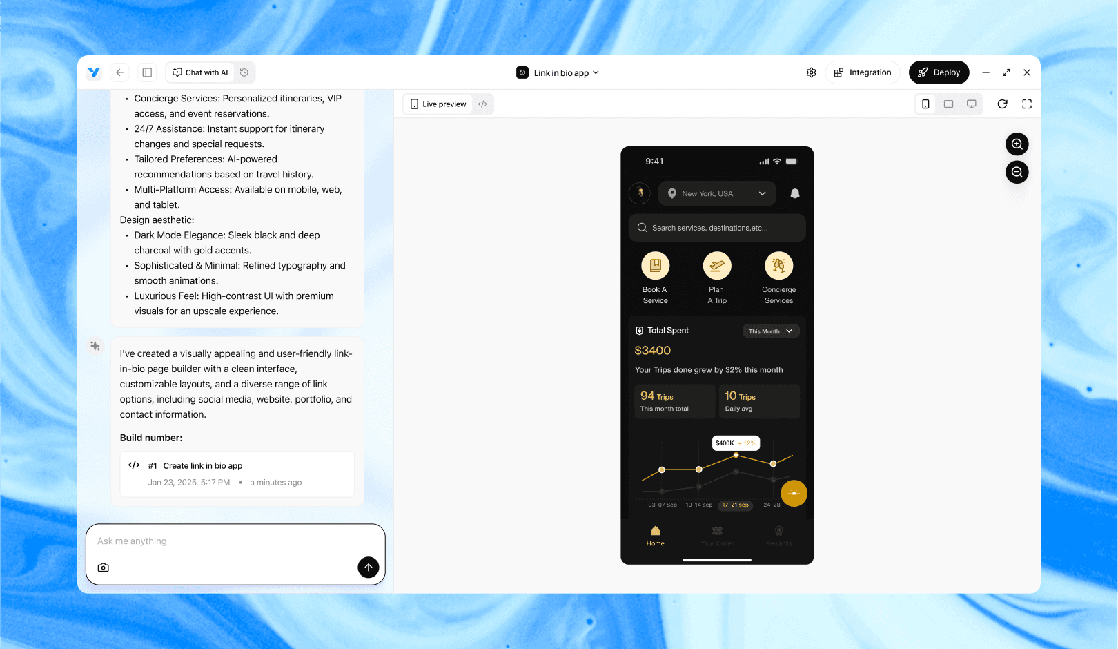
Vibe Studio, powered by Steve’s advanced AI agents, is a revolutionary no-code, conversational platform that empowers users to quickly and efficiently create full-stack Flutter applications integrated seamlessly with Firebase backend services. Ideal for solo founders, startups, and agile engineering teams, Vibe Studio allows users to visually manage and deploy Flutter apps, greatly accelerating the development process. The intuitive conversational interface simplifies complex development tasks, making app creation accessible even for non-coders.
Conclusion
Accessible color systems in Flutter combine design intent, semantic tokens, programmatic contrast checks, and runtime adaptation. Treat colors as behavior, not static assets: derive onSurface colors, test across states, and provide user controls for enhanced contrast. These patterns reduce regressions and make your app reliably usable for more people while maintaining visual consistency across themes.


