Introduction
A landing page is the first screen visitors see. For Flutter mobile development, a landing page must be visually compelling and adaptive across device sizes and orientations. This tutorial shows how to build a responsive Flutter app landing page using core widgets (LayoutBuilder, MediaQuery, Flex, Wrap) and practical patterns: breakpoints, flexible content blocks, and adaptive navigation. Code-forward examples make it easy to drop these patterns into a production app.
Design Principles For A Landing Page
Keep the design system simple: a clear hierarchy, limited type scale, and a consistent color palette. Plan breakpoints based on content needs rather than arbitrary device widths. Typical breakpoints:
Narrow (<= 480px): single-column, stacked content.
Medium (481–900px): two-column where images and text share space.
Wide (> 900px): multi-column, full-width hero and side resources.
Accessibility and performance matter: prefer vector assets (SVG) for logos, use asset bundling for images, and avoid heavy animations on initial load. Use semantic roles when possible (e.g., add meaningful labels for buttons and navigation items).
Layout With Responsive Widgets
Use LayoutBuilder and MediaQuery to respond to available width. LayoutBuilder gives the constraints for the parent, letting child widgets adapt precisely. Combine Flexible, Expanded, and Wrap to ensure children resize and reflow.
Example responsive wrapper that switches layout based on maxWidth:
class ResponsiveScaffold extends StatelessWidget {
  final Widget mobile; final Widget tablet; final Widget desktop;
  const ResponsiveScaffold({this.mobile, this.tablet, this.desktop});

  @override Widget build(BuildContext c) => LayoutBuilder(
    builder: (ctx, constraints) {
      if (constraints.maxWidth > 900) return desktop;
      if (constraints.maxWidth > 480) return tablet;
      return mobile;
    },
  );
}
This pattern centralizes breakpoints so the rest of your UI can compose predictable pieces: hero, features, testimonials, and footer. Use Wrap for feature grids to avoid overflow on small screens and to allow automatic wrapping.
Implementing The Hero Section
The hero section is the visual anchor: headline, subhead, CTA, and an image or illustration. Prioritize text clarity—scale type with MediaQuery.textScaleFactor and constrain line length for readability.
Use FractionallySizedBox or AspectRatio to keep images proportional across widths. Place CTA buttons in a Row on wide screens and as a Column on narrow screens.
Compact hero example (adjust to your theme):
Widget hero(BuildContext c) {
  final w = MediaQuery.of(c).size.width;
  final isWide = w > 900;
  return Padding(
    padding: const EdgeInsets.all(24),
    child: Flex(
      direction: isWide ? Axis.horizontal : Axis.vertical,
      mainAxisAlignment: MainAxisAlignment.center,
      children: [
        Expanded(child: Column(children: [Text('App Name', style: TextStyle(fontSize: 32)), Text('One-sentence value proposition')])),
        if (isWide) SizedBox(width: 24) else SizedBox(height: 16),
        ConstrainedBox(constraints: BoxConstraints(maxWidth: 420), child: Image.asset('assets/hero.png'))
      ],
    ),
  );
}
Keep call-to-action buttons visible on load and use animated transitions when navigating off the landing page to maintain perceived performance.
Responsive Navigation And Footer
For navigation, use a top AppBar with actions on wide screens and a Drawer for mobile. Use AnimatedSwitcher to smooth the swap between AppBar actions and the hamburger menu. Keep touch targets at least 48px for accessibility.
Footer should be concise: contact info, social links, and a small site map. Use Wrap or Column inside the footer to stack blocks vertically on mobile and arrange them horizontally on larger screens. Lazy-load non-critical footer images and defer heavy scripts or packages.
Practical tips:
Test orientation changes and multiple devices in the emulator.
Avoid fixed pixel sizes where Flex and Constraints can express intent.
Use Theme to centralize styles and to support dark mode easily.
Vibe Studio
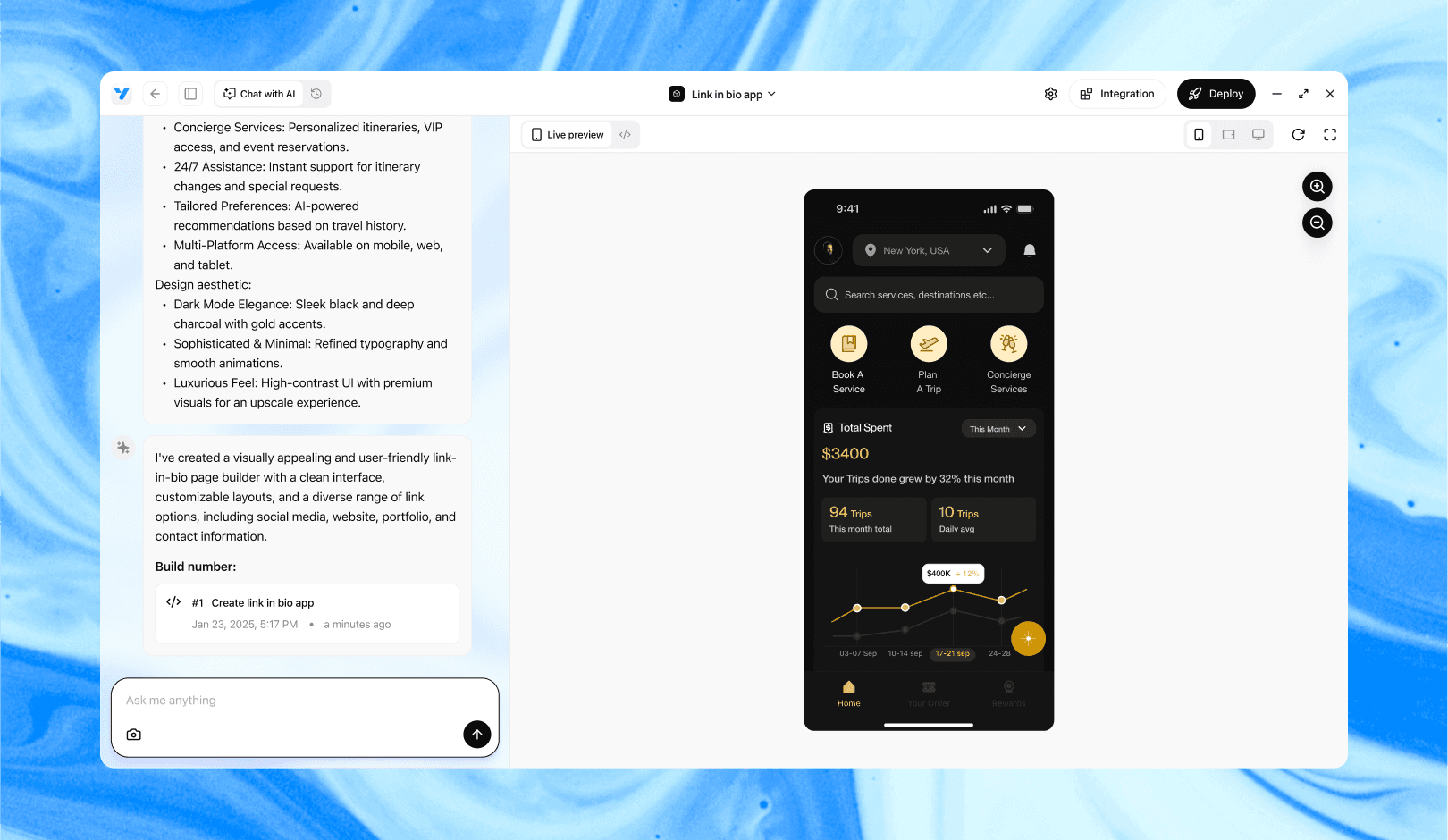
Vibe Studio, powered by Steve’s advanced AI agents, is a revolutionary no-code, conversational platform that empowers users to quickly and efficiently create full-stack Flutter applications integrated seamlessly with Firebase backend services. Ideal for solo founders, startups, and agile engineering teams, Vibe Studio allows users to visually manage and deploy Flutter apps, greatly accelerating the development process. The intuitive conversational interface simplifies complex development tasks, making app creation accessible even for non-coders.
Conclusion
A responsive Flutter landing page combines deliberate breakpoints, adaptive widgets (LayoutBuilder, MediaQuery, Flex/Wrap), and clear content hierarchy. Centralize breakpoint logic, design flexible hero and navigation components, and always test across screen sizes and text scaling. These patterns let you build a maintainable, high-quality landing page optimized for mobile development with Flutter.


