Introduction
Stacks and Positioned widgets are fundamental when you need layered, free-form layouts in Flutter. Unlike Row and Column, which arrange children linearly, Stack lets you place widgets on top of one another. Positioned gives you pixel-precise control inside the Stack. This tutorial walks through the basics and shows a practical example that demonstrates overlapping cards, anchored badges, and responsive behavior for mobile development.
Stack Basics
A Stack paints its children in order, with the first child at the bottom and later children on top. By default, non-positioned children are aligned as governed by the Stack's alignment property (Alignment.topLeft by default). Use fit to control how non-positioned children size relative to the Stack (loose by default).
Key properties:
alignment: controls where non-positioned children appear.
fit: StackFit.loose, StackFit.expand, etc., to control sizing.
clipBehavior: whether children outside bounds are clipped.
Simple Stack example:
Stack(
  alignment: Alignment.center,
  children: [
    Container(width: 200, height: 200, color: Colors.blue),
    Text('Centered', style: TextStyle(color: Colors.white)),
  ],
)
This creates a centered Text above a blue square. For mobile development, remember the Stack will be constrained by its parent; if you want it to fill available space use SizedBox.expand, Expanded, or StackFit.expand.
Positioning Widgets Precisely
Positioned allows specifying any combination of left, top, right, bottom, width, and height. The values are offsets relative to the Stack's edges. If you specify both left and right, the positioned child's width is derived by subtracting left+right from the Stack's width.
Common patterns:
Anchoring: Positioned(top: 8, right: 8) to pin an element to the top-right corner.
Centering with offsets: Positioned.fill(child: Align(alignment: Alignment.center, child: ...))
Size constraints: specify width and height for exact sizing.
Example with an anchored badge:
Stack(
  children: [
    Image.asset('assets/photo.jpg'),
    Positioned(top: 8, right: 8,
      child: Container(padding: EdgeInsets.all(6), color: Colors.red, child: Text('NEW'))),
  ],
)
This pattern is frequent in mobile development for overlays (badges, play buttons, captions).
Practical Example: Overlapping Cards
Let's build a compact pattern: a stack of overlapping cards where each card is partially visible, and a floating action sits on the top-right. Use a fixed height container for the Stack and compute offsets using margins.
Approach:
Base layer: a background container with a subtle shadow.
Middle layers: cards positioned with increasing left offsets (e.g., 0, 24, 48) creating overlap.
Top layer: an action button positioned with top/right to float above the cards.
Responsive note: Use MediaQuery or LayoutBuilder to scale offsets by screen width when needed. Example structure (pseudo-flow): Container(height: 220) -> Stack -> Positioned cards -> Positioned action button.
Accessibility: ensure meaningful semantics for overlapping content. When visual stacking hides interactive regions, consider providing alternative controls or a collapsible list view.
Tips And Best Practices
Prefer non-positioned children for simple layouts; use Positioned only when you need overlap or precise offsets.
Avoid excessive nesting of Stacks; they can be harder to reason about and may cause layout thrash if overused.
Use LayoutBuilder to adapt offsets and sizes to different screen sizes in mobile development.
For animations, animate Positioned using AnimatedPositioned for smooth transitions without managing your own AnimationController.
Be mindful of hit-testing: an upper widget captures gestures before widgets below it. Use IgnorePointer if you need clicks to pass through.
Performance: Stack itself is lightweight. Watch out for large offscreen widgets in complex stacks; consider clipping and lazy-building heavy children.
Vibe Studio
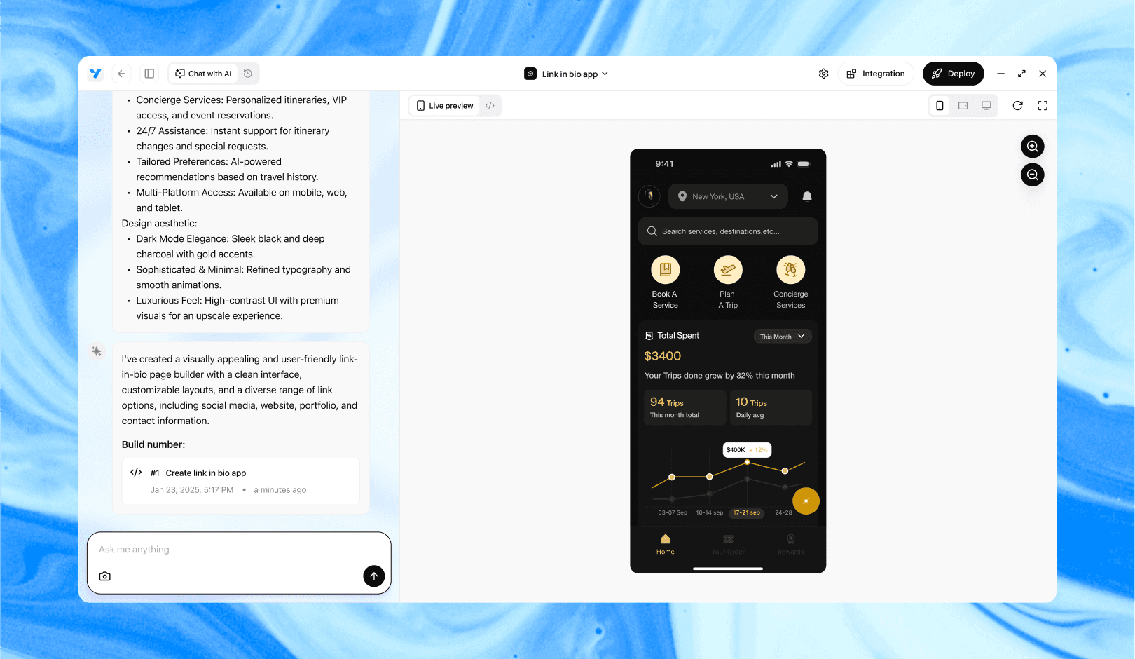
Vibe Studio, powered by Steve’s advanced AI agents, is a revolutionary no-code, conversational platform that empowers users to quickly and efficiently create full-stack Flutter applications integrated seamlessly with Firebase backend services. Ideal for solo founders, startups, and agile engineering teams, Vibe Studio allows users to visually manage and deploy Flutter apps, greatly accelerating the development process. The intuitive conversational interface simplifies complex development tasks, making app creation accessible even for non-coders.
Conclusion
Stacks and Positioned widgets give you powerful, explicit control for layered mobile UIs in Flutter. Start with simple non-positioned children to learn alignment and fit, then introduce Positioned for anchors and overlaps. Use LayoutBuilder and animated variants for responsive and interactive designs. With these patterns you can build rich overlays, custom alignment schemes, and visually engaging mobile experiences quickly and predictably.


