Introduction
Supporting both dark and light modes is a must for modern mobile development with Flutter. Users expect apps to follow system appearance, reduce eye strain, and respect accessibility settings. This tutorial shows pragmatic patterns and minimal code to implement reliable theming: adaptive palettes, ThemeData and ColorScheme usage, handling images and custom widgets, and testing strategies so your Flutter UI looks right in both modes.
Designing Adaptive Color Palettes
Avoid hard-coded colors. Define semantic colors (primary, surface, background, onPrimary, etc.) for each mode instead of choosing colors per widget. With semantic tokens you change the app’s look by swapping palettes rather than hunting through the codebase.
Create light and dark ColorScheme objects. Prefer color contrasts that meet accessibility standards (>=4.5:1 for text). Material color utilities and contrast checkers can help.
Keep these rules:
Use primary for interactive elements and accent highlights.
Use surface for cards, sheets, and panels.
Use onPrimary/onSurface for content placed on those backgrounds.
Reserve accent/secondary for non-primary actions.
Example palette structure (pseudocode):
lightScheme: bright background, dark text, saturated primary
darkScheme: dark background, light text, desaturated primary with higher emphasis on elevation tinting
Using ThemeData And ColorScheme
Flutter’s ThemeData and ColorScheme are the backbone for consistent theming. Use MaterialApp/MaterialApp.router with theme, darkTheme, and themeMode to let the system toggle automatically.
This example shows a minimal app-level setup using ColorScheme and ThemeData. Note how you avoid inline colors on widgets; instead, reference Theme.of(context).
final lightScheme = ColorScheme.fromSeed(seedColor: Colors.blue, brightness: Brightness.light);
final darkScheme = ColorScheme.fromSeed(seedColor: Colors.blue, brightness: Brightness.dark);

MaterialApp(
  theme: ThemeData(colorScheme: lightScheme, useMaterial3: true),
  darkTheme: ThemeData(colorScheme: darkScheme, useMaterial3: true),
  themeMode: ThemeMode.system,
  home: HomePage(),
);
In widgets prefer Theme.of(context).colorScheme.primary or Theme.of(context).textTheme.titleMedium rather than raw Colors.*. For component-level tweaks, use copyWith on ThemeData or extend ColorScheme with custom semantic properties.
Dynamically switching themeMode can be persisted with Provider, Riverpod, or other state-management solutions. Persist the user preference and fall back to ThemeMode.system.
Handling Images And Custom Widgets
Images and icons require special attention: dark backgrounds can make images appear wrong or invisible. Strategies:
Provide both light and dark variants of raster icons and images and select by brightness.
Use SvgPicture with currentColor support so vector assets inherit color from IconTheme or colorFilter.
Apply ColorFiltered widgets to tint grayscale assets.
Detect mode with Theme.of(context).brightness (or MediaQuery.platformBrightness if you prefer platform value). Example conditional widget logic:
final isDark = Theme.of(context).brightness == Brightness.dark;
Image.asset(isDark ? 'assets/img/dark_logo.png' : 'assets/img/light_logo.png');
For custom widgets, expose semantic color parameters that default to Theme.of(context).colorScheme.*. This keeps components reusable and theme-aware.
Testing And Previewing Modes
Test thoroughly on multiple devices and OS-level modes. Useful approaches:
Manually toggle system theme on iOS/Android during QA.
Use Flutter’s Device Preview package or the built-in emulator settings to switch brightness quickly.
Write widget tests that pump widgets with a dark ThemeData to verify color-dependent behavior.
Automated tests: create Golden tests for both themes. Golden testing surfaces visual regressions across appearances. Also include accessibility checks for contrast ratios in CI where possible.
Performance tip: avoid rebuilding the entire app when theme changes. Flutter’s theme switching is efficient, but minimize expensive rebuilds by placing theme-dependent widgets close to the root and keeping heavy subtrees stateless where possible.
Vibe Studio
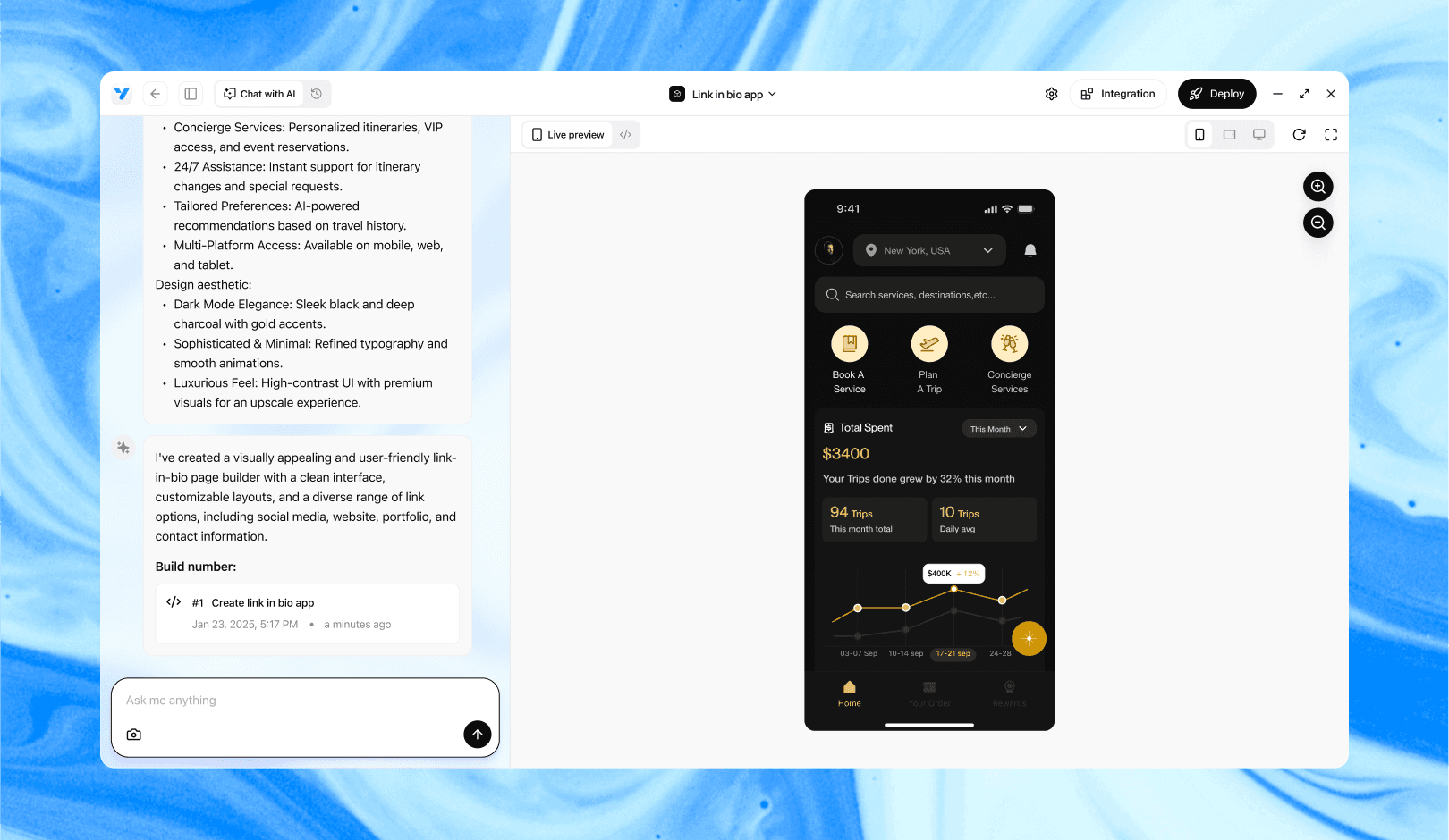
Vibe Studio, powered by Steve’s advanced AI agents, is a revolutionary no-code, conversational platform that empowers users to quickly and efficiently create full-stack Flutter applications integrated seamlessly with Firebase backend services. Ideal for solo founders, startups, and agile engineering teams, Vibe Studio allows users to visually manage and deploy Flutter apps, greatly accelerating the development process. The intuitive conversational interface simplifies complex development tasks, making app creation accessible even for non-coders.
Conclusion
Implementing robust dark and light mode support in Flutter is largely about planning: use semantic color schemes, centralize theme configuration with ThemeData and ColorScheme, handle images and custom widgets explicitly, and validate with testing across devices. These practices keep your codebase maintainable while delivering a polished, accessible experience for users regardless of system appearance.


