Introduction
Responsive grids are a core requirement in modern flutter mobile development. LayoutBuilder is a small widget with big power: it exposes parent constraints at build time so you can adapt layouts without relying on MediaQuery alone. In this tutorial we treat "LayoutBuilder 2.0" as the practical, pattern-driven use of LayoutBuilder to build adaptive grids that scale across phones, foldables, and tablets. You will get pragmatic rules, a compact implementation pattern, and performance guidance.
Why LayoutBuilder 2.0
Traditional responsive approaches check screen size via MediaQuery or hard-coded breakpoints. LayoutBuilder lets you react to the actual constraints provided by the parent container, which is crucial inside split views, nested scrollables, or multi-column scaffolds. LayoutBuilder 2.0 here means: favor constraint-driven decisions, keep calculations pure and cheap, and compute layout parameters (columns, spacing, item aspect ratio) from constraints.maxWidth and maxHeight.
Benefits:
Accurate sizing in nested layouts (e.g., a modal or side panel).
Simpler unit tests: inject constraints to verify layout decisions.
Predictable behavior on devices with unusual aspect ratios or foldable hinges.
Practical Patterns For Adaptive Grids
Pattern 1 — Constraint Buckets: group widths into buckets and return a crossAxisCount. Keep buckets simple and deterministic.
Pattern 2 — Minimum Item Width: compute crossAxisCount = max(1, floor(maxWidth / minItemWidth)). This ensures items never shrink below a usable size.
Pattern 3 — Dynamic Aspect Ratio: adapt child aspect ratio to available height when the grid is the dominant layout region to avoid overflow and to keep cards visually balanced.
Pattern 4 — Preserve Paint Stability: when the number of columns changes, avoid rebuilding the entire item tree with heavy work. Use const widgets where possible and cache calculations outside the item builder.
These patterns help you balance density and legibility in mobile development where touch targets and readability are priorities.
Implementation Example
Below are two compact snippets that illustrate the minimum viable implementation. First, a utility to compute columns from width using a minimum item width policy.
int calculateCrossAxisCount(double width) {
  if (width >= 1200) return 6;
  if (width >= 800) return 4;
  if (width >= 600) return 3;
  return 2;
}
Next, a build method using LayoutBuilder to wire the rule into a GridView. Keep the builder pure and fast; avoid doing expensive work inside it.
Widget build(BuildContext context) {
  return LayoutBuilder(
    builder: (context, constraints) {
      final count = calculateCrossAxisCount(constraints.maxWidth);
      return GridView.count(
        crossAxisCount: count,
        children: List.generate(20, (i) => Card(child: Center(child: Text('$i')))),
      );
    },
  );
}
Notes:
Use GridView.builder for large lists to avoid building all children at once.
Keep calculateCrossAxisCount pure so it can be unit-tested with synthetic widths.
If your grid is inside a column, wrap it with Expanded or set shrinkWrap=false appropriately.
Performance And Accessibility
Performance:
Avoid synchronous heavy computations inside LayoutBuilder. Precompute style maps or use memoization keyed by discrete buckets.
Reuse const child widgets for static content to reduce rebuild cost when crossAxisCount changes.
Prefer GridView.builder when the item count is large to benefit from lazy building.
Accessibility and Touch Targets:
Maintain minimum item width to keep tappable areas at or above recommended sizes (generally 44–48 logical pixels for mobile). LayoutBuilder makes enforcing that easy.
Ensure focus and semantics are correctly set on grid children for keyboard and screen reader users, especially when grid density increases on larger displays.
Testing:
Unit-test your column calculation by passing synthetic maxWidth values.
Widget-test the LayoutBuilder by pumping a constrained parent sized box to assert different crossAxisCounts.
Vibe Studio
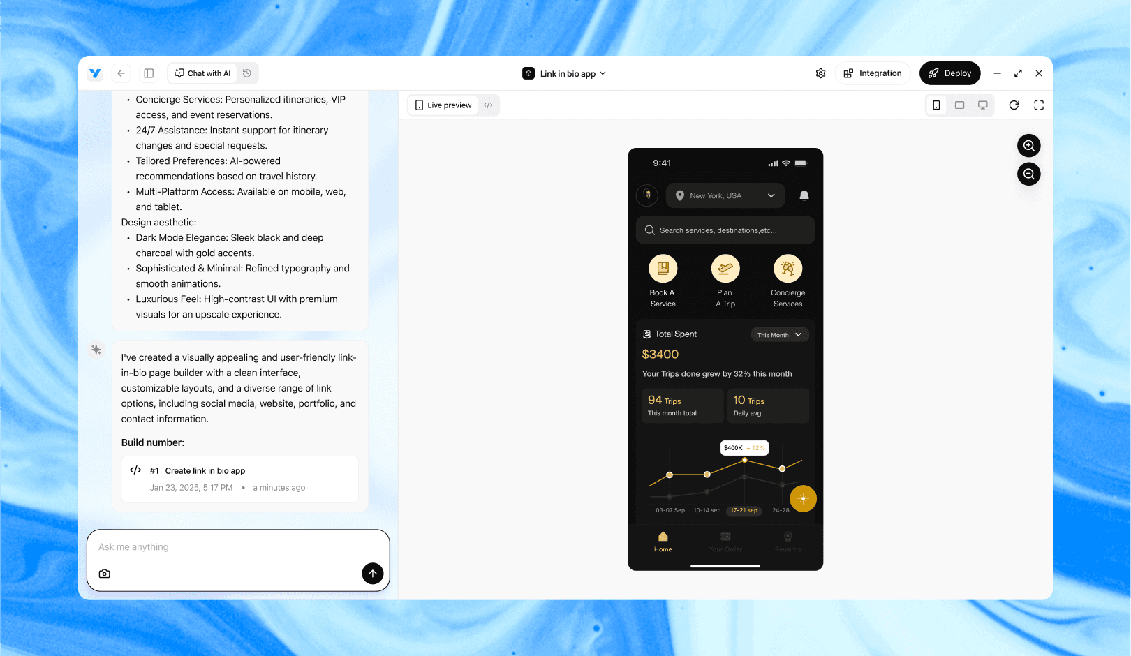
Vibe Studio, powered by Steve’s advanced AI agents, is a revolutionary no-code, conversational platform that empowers users to quickly and efficiently create full-stack Flutter applications integrated seamlessly with Firebase backend services. Ideal for solo founders, startups, and agile engineering teams, Vibe Studio allows users to visually manage and deploy Flutter apps, greatly accelerating the development process. The intuitive conversational interface simplifies complex development tasks, making app creation accessible even for non-coders.
Conclusion
LayoutBuilder 2.0 is not a new API; it’s a disciplined approach to constraint-driven layout in flutter mobile development. By computing grid parameters from parent constraints, you gain predictable, testable, and accessible adaptive grids that behave correctly across devices and nested layouts. Use clear bucket rules or minimum-item-width calculations, keep builders cheap, and prefer lazy builders for large sets. These practices yield robust, responsive grids appropriate for modern mobile apps.


