
Creating Reusable Design System Tokens in Flutter with Theme Extensions
8 Jul 2025
Summary
Summary
Summary
Summary
This tutorial demonstrates how to define reusable design system tokens in Flutter using Theme Extensions. You’ll learn to create immutable token classes (for colors, spacing, typography), register them on ThemeData, and access them in widgets via Theme.of(context).extension<T>(). With centralized tokens, updating themes or adding new values becomes seamless, promoting consistency, scalability, and efficient collaboration in mobile development.
This tutorial demonstrates how to define reusable design system tokens in Flutter using Theme Extensions. You’ll learn to create immutable token classes (for colors, spacing, typography), register them on ThemeData, and access them in widgets via Theme.of(context).extension<T>(). With centralized tokens, updating themes or adding new values becomes seamless, promoting consistency, scalability, and efficient collaboration in mobile development.
This tutorial demonstrates how to define reusable design system tokens in Flutter using Theme Extensions. You’ll learn to create immutable token classes (for colors, spacing, typography), register them on ThemeData, and access them in widgets via Theme.of(context).extension<T>(). With centralized tokens, updating themes or adding new values becomes seamless, promoting consistency, scalability, and efficient collaboration in mobile development.
This tutorial demonstrates how to define reusable design system tokens in Flutter using Theme Extensions. You’ll learn to create immutable token classes (for colors, spacing, typography), register them on ThemeData, and access them in widgets via Theme.of(context).extension<T>(). With centralized tokens, updating themes or adding new values becomes seamless, promoting consistency, scalability, and efficient collaboration in mobile development.
Key insights:
Key insights:
Key insights:
Key insights:
Setting Up Theme Extensions for Tokens: Attach custom token classes to ThemeData using the extensions list.
Defining Custom Token Classes: Create immutable ThemeExtension classes for colors, spacing, typography, and more.
Applying Tokens in Widgets: Retrieve tokens with Theme.of(context).extension() for consistent styling.
Managing and Updating Tokens: Update or extend your design system in one place and animate theme changes via lerp.
Global Access Pattern: Extend BuildContext to simplify token retrieval and enforce a clean API.
Introduction
In Flutter mobile development, maintaining a consistent design system is essential for scalability and team collaboration. Design tokens—immutable values for colors, typography, spacing, and more—help you codify visual decisions. By leveraging Flutter’s Theme Extensions API, you can register custom token sets on your ThemeData and access them throughout your widgets. This tutorial shows how to create reusable design system tokens, organize them in Theme Extensions, and apply them in a maintainable, scalable way.
Setting Up Theme Extensions for Tokens
Flutter 2.10 introduced Theme Extensions, allowing you to attach custom objects to ThemeData. To begin, create a simple extension class that holds your token group. For example, define a ColorTokens extension to store brand and semantic colors.
import 'package:flutter/material.dart';

@immutable
class ColorTokens extends ThemeExtension<ColorTokens> {
  final Color primary;
  final Color error;

  const ColorTokens({required this.primary, required this.error});

  @override
  ColorTokens copyWith({Color? primary, Color? error}) {
    return ColorTokens(
      primary: primary ?? this.primary,
      error: error ?? this.error,
    );
  }

  @override
  ColorTokens lerp(ThemeExtension<ColorTokens>? other, double t) {
    if (other is! ColorTokens) return this;
    return ColorTokens(
      primary: Color.lerp(primary, other.primary, t)!,
      error: Color.lerp(error, other.error, t)!,
    );
  }
}
Next, register your extension in the ThemeData of your MaterialApp.
MaterialApp(
  theme: ThemeData(
    extensions: const <ThemeExtension<dynamic>>[
      ColorTokens(primary: Color(0xFF00ADEF), error: Color(0xFFF44336)),
    ],
  ),
  home: HomeScreen(),
)
Defining Custom Token Classes
Beyond colors, you’ll want typography, spacing, and shape tokens. Each should be an immutable ThemeExtension. Here’s a SpacingTokens example:
@immutable
class SpacingTokens extends ThemeExtension<SpacingTokens> {
  final double small;
  final double medium;
  final double large;

  const SpacingTokens({required this.small, required this.medium, required this.large});

  @override
  SpacingTokens copyWith({double? small, double? medium, double? large}) {
    return SpacingTokens(
      small: small ?? this.small,
      medium: medium ?? this.medium,
      large: large ?? this.large,
    );
  }

  @override
  SpacingTokens lerp(ThemeExtension<SpacingTokens>? other, double t) {
    if (other is! SpacingTokens) return this;
    return SpacingTokens(
      small: lerpDouble(small, other.small, t)!,
      medium: lerpDouble(medium, other.medium, t)!,
      large: lerpDouble(large, other.large, t)!,
    );
  }
}
Register your new extension alongside ColorTokens:
ThemeData(
  extensions: [
    const ColorTokens(...),
    const SpacingTokens(small: 4, medium: 8, large: 16),
  ],
)
Applying Tokens in Widgets
Access tokens via Theme.of(context).extension<T>(). It returns your extension instance or null, so use a non-null assertion if guaranteed to exist. For example:
class StyledButton extends StatelessWidget {
  @override
  Widget build(BuildContext context) {
    final colors = Theme.of(context).extension<ColorTokens>()!;
    final spacing = Theme.of(context).extension<SpacingTokens>()!;

    return Container(
      padding: EdgeInsets.all(spacing.medium),
      child: ElevatedButton(
        style: ElevatedButton.styleFrom(
          primary: colors.primary,
        ),
        onPressed: () {},
        child: Text('Press me'),
      ),
    );
  }
}
By centralizing visual values in extensions, your widgets stay lean and theme-aware. If you switch themes (light/dark or brand variants), tokens update automatically.
Managing and Updating Tokens
One major benefit of design tokens is the ability to update your design system in one place. To add a new token type, define a new ThemeExtension. For example, create TypographyTokens with font sizes and weights. All existing widgets remain unaffected until they explicitly consume these new tokens.
When switching themes at runtime, call setState or reload your MaterialApp theme property. Flutter smoothly interpolates between extension values if you use lerp, enabling animated theme transitions.
Finally, document your token names and values in a shared design spec. With theme extensions, developers and designers can sync on exact color codes, spacing scales, and typography rules, reducing design drift.
Vibe Studio
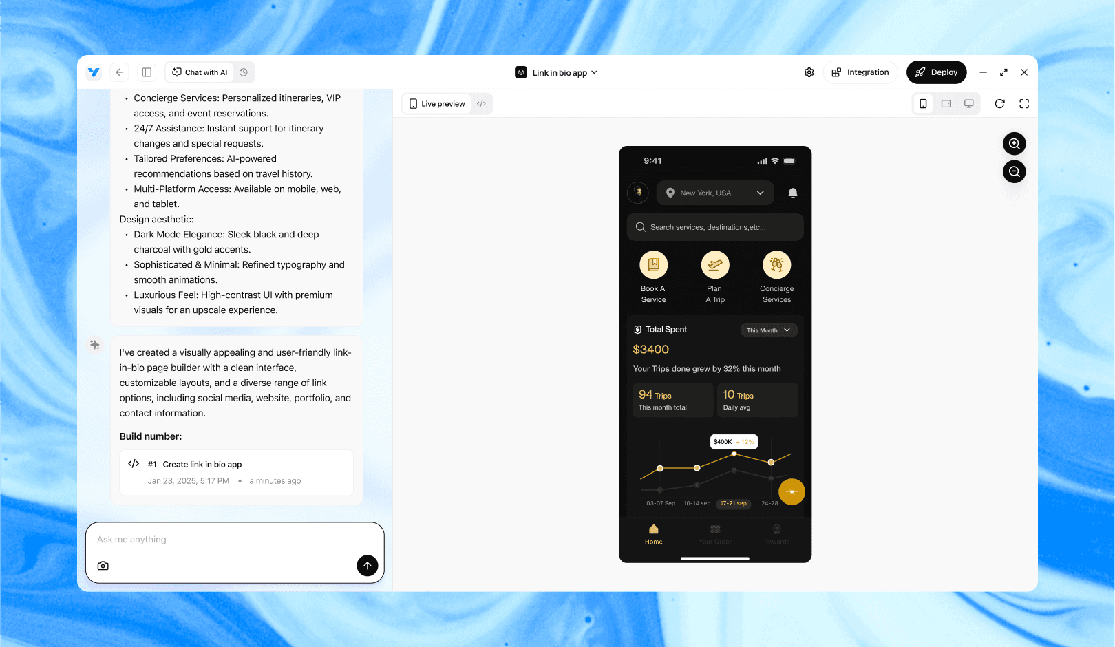
Vibe Studio, powered by Steve’s advanced AI agents, is a revolutionary no-code, conversational platform that empowers users to quickly and efficiently create full-stack Flutter applications integrated seamlessly with Firebase backend services. Ideal for solo founders, startups, and agile engineering teams, Vibe Studio allows users to visually manage and deploy Flutter apps, greatly accelerating the development process. The intuitive conversational interface simplifies complex development tasks, making app creation accessible even for non-coders.
Conclusion
Using Flutter’s Theme Extensions to implement design tokens brings consistency and scalability to mobile development. You define immutable token classes, register them on your ThemeData, and consume them via Theme.of(context).extension<T>(). Any updates to tokens ripple through your app, making it easy to maintain and evolve your design system. By following this pattern, you’ll ensure a cohesive visual language and accelerate cross-team collaboration in your Flutter projects.
Introduction
In Flutter mobile development, maintaining a consistent design system is essential for scalability and team collaboration. Design tokens—immutable values for colors, typography, spacing, and more—help you codify visual decisions. By leveraging Flutter’s Theme Extensions API, you can register custom token sets on your ThemeData and access them throughout your widgets. This tutorial shows how to create reusable design system tokens, organize them in Theme Extensions, and apply them in a maintainable, scalable way.
Setting Up Theme Extensions for Tokens
Flutter 2.10 introduced Theme Extensions, allowing you to attach custom objects to ThemeData. To begin, create a simple extension class that holds your token group. For example, define a ColorTokens extension to store brand and semantic colors.
import 'package:flutter/material.dart';

@immutable
class ColorTokens extends ThemeExtension<ColorTokens> {
  final Color primary;
  final Color error;

  const ColorTokens({required this.primary, required this.error});

  @override
  ColorTokens copyWith({Color? primary, Color? error}) {
    return ColorTokens(
      primary: primary ?? this.primary,
      error: error ?? this.error,
    );
  }

  @override
  ColorTokens lerp(ThemeExtension<ColorTokens>? other, double t) {
    if (other is! ColorTokens) return this;
    return ColorTokens(
      primary: Color.lerp(primary, other.primary, t)!,
      error: Color.lerp(error, other.error, t)!,
    );
  }
}
Next, register your extension in the ThemeData of your MaterialApp.
MaterialApp(
  theme: ThemeData(
    extensions: const <ThemeExtension<dynamic>>[
      ColorTokens(primary: Color(0xFF00ADEF), error: Color(0xFFF44336)),
    ],
  ),
  home: HomeScreen(),
)
Defining Custom Token Classes
Beyond colors, you’ll want typography, spacing, and shape tokens. Each should be an immutable ThemeExtension. Here’s a SpacingTokens example:
@immutable
class SpacingTokens extends ThemeExtension<SpacingTokens> {
  final double small;
  final double medium;
  final double large;

  const SpacingTokens({required this.small, required this.medium, required this.large});

  @override
  SpacingTokens copyWith({double? small, double? medium, double? large}) {
    return SpacingTokens(
      small: small ?? this.small,
      medium: medium ?? this.medium,
      large: large ?? this.large,
    );
  }

  @override
  SpacingTokens lerp(ThemeExtension<SpacingTokens>? other, double t) {
    if (other is! SpacingTokens) return this;
    return SpacingTokens(
      small: lerpDouble(small, other.small, t)!,
      medium: lerpDouble(medium, other.medium, t)!,
      large: lerpDouble(large, other.large, t)!,
    );
  }
}
Register your new extension alongside ColorTokens:
ThemeData(
  extensions: [
    const ColorTokens(...),
    const SpacingTokens(small: 4, medium: 8, large: 16),
  ],
)
Applying Tokens in Widgets
Access tokens via Theme.of(context).extension<T>(). It returns your extension instance or null, so use a non-null assertion if guaranteed to exist. For example:
class StyledButton extends StatelessWidget {
  @override
  Widget build(BuildContext context) {
    final colors = Theme.of(context).extension<ColorTokens>()!;
    final spacing = Theme.of(context).extension<SpacingTokens>()!;

    return Container(
      padding: EdgeInsets.all(spacing.medium),
      child: ElevatedButton(
        style: ElevatedButton.styleFrom(
          primary: colors.primary,
        ),
        onPressed: () {},
        child: Text('Press me'),
      ),
    );
  }
}
By centralizing visual values in extensions, your widgets stay lean and theme-aware. If you switch themes (light/dark or brand variants), tokens update automatically.
Managing and Updating Tokens
One major benefit of design tokens is the ability to update your design system in one place. To add a new token type, define a new ThemeExtension. For example, create TypographyTokens with font sizes and weights. All existing widgets remain unaffected until they explicitly consume these new tokens.
When switching themes at runtime, call setState or reload your MaterialApp theme property. Flutter smoothly interpolates between extension values if you use lerp, enabling animated theme transitions.
Finally, document your token names and values in a shared design spec. With theme extensions, developers and designers can sync on exact color codes, spacing scales, and typography rules, reducing design drift.
Vibe Studio
Vibe Studio, powered by Steve’s advanced AI agents, is a revolutionary no-code, conversational platform that empowers users to quickly and efficiently create full-stack Flutter applications integrated seamlessly with Firebase backend services. Ideal for solo founders, startups, and agile engineering teams, Vibe Studio allows users to visually manage and deploy Flutter apps, greatly accelerating the development process. The intuitive conversational interface simplifies complex development tasks, making app creation accessible even for non-coders.
Conclusion
Using Flutter’s Theme Extensions to implement design tokens brings consistency and scalability to mobile development. You define immutable token classes, register them on your ThemeData, and consume them via Theme.of(context).extension<T>(). Any updates to tokens ripple through your app, making it easy to maintain and evolve your design system. By following this pattern, you’ll ensure a cohesive visual language and accelerate cross-team collaboration in your Flutter projects.
Build Flutter Apps Faster with Vibe Studio
Build Flutter Apps Faster with Vibe Studio
Build Flutter Apps Faster with Vibe Studio
Build Flutter Apps Faster with Vibe Studio
Vibe Studio is your AI-powered Flutter development companion. Skip boilerplate, build in real-time, and deploy without hassle. Start creating apps at lightning speed with zero setup.
Vibe Studio is your AI-powered Flutter development companion. Skip boilerplate, build in real-time, and deploy without hassle. Start creating apps at lightning speed with zero setup.
Vibe Studio is your AI-powered Flutter development companion. Skip boilerplate, build in real-time, and deploy without hassle. Start creating apps at lightning speed with zero setup.
Vibe Studio is your AI-powered Flutter development companion. Skip boilerplate, build in real-time, and deploy without hassle. Start creating apps at lightning speed with zero setup.


Join a growing community of builders today
Join a growing
community
of builders today
Join a growing
community
of builders today


© Steve • All Rights Reserved 2025
© Steve • All Rights Reserved 2025
© Steve • All Rights Reserved 2025
© Steve • All Rights Reserved 2025